BUILDING A TECH COMPANY FROM THE GROUND UP
Ezoria is a Vacation Rental company with a mission to unlock the potential of every property they undertake and bring real and hospitable experiences that guests desire.
Ezoria came to me with a need to rebrand their business. They had already done their market research and had a rough idea of what the new brand identity wanted to communicate.
Below you will find the roadmap of this process.

BRAND PURPOSE
Our clients are SEO’s, corporate executives, corporations and organisations that seek to simplify and automate their processes, daily time consuming tasks and be focused on their work. We are here to support and provide them with the appropriate solutions to achieve and maintain a productive work life.
BRAND VISION
Our vision is to be one of our country’s pioneers in the technology industry, that provides corporations, organisations and health professionals, practical and effective solutions.
BRAND MISSION
We are committed in making our clients feel safe & supported when working with us. To provide them the solution to work efficiently & stay focused on their job’s daily tasks, without worrying for dealing with complex hardware & software use & issues.
BRAND CORE VALUES
Intelligence
Honesty
Integrity
Trust
Safety
DIFFERENTIATOR (USP) STATEMENT
WE PROVIDE SIMPLIFIED EFFICENT SOFTWARE & HARDWARE SOLUTIONS WITH SUPPORT IN TIMES OF URGENCY
POSITIONING STATEMENT
WE HELP HEALTH PROFESIONALS AND ORGANISATIONS WHO WANT SUPPORT & SIMPLIFIED SOFTWARE PROCESSES TO ACHIEVE / EXPERIENCE CONTROL. OUR SOLUTION OFFERS SUPPORT IN TIMES OF URGENCY.
AUDIENCE PERSONA ARCHETYPE
THE RULER / THE CREATOR
DEMOGRAPHICS, PSYCHOGRAPHICS
ENTERTAINMENT, INTERESTS, HOBBIES
PERSONALITY
BEHAVIOURAL CHARACTERISTICS: AMBITIOUS, BUSINESSMAN, FOCUSED, BRIGHT
POLITICAL OR SOCIAL OPINION: LIBERAL
PASSIONATE ABOUT: Research & Innovation
OBLIGATIONS THEY HATE: PUTTING PERSONAL INFORMATION ON THEIR SOCIAL PLATFORMS
BIGGEST PERSONAL GOAL: RAISE SUCCESSFUL CHILDREN
BIGGEST PROFESSIONAL GOAL: BUSINESS & INNOVATION EXPANSION
♥ CORE VALUES: HARDWORK
♥ CORE FEARS: BUSINESS FAILURE
♥ CORE DESIRE: SUCCESS, EXPANSION INNOVATION
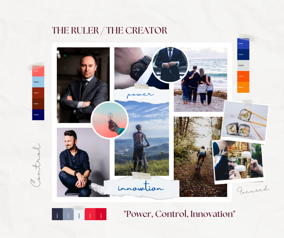
BRAND PERSONA ARCHETYPE
MOODBOARDS

CORE MESSAGE
AUDIENCE
We help CEOS & HEALTH PROFESSIONALS who have the desire to simplify and work efficiently while working in a harmonic environment. They are successful in their business and want to run it as smoothly as possible while focusing on bigger goals.
PAIN-POINTS
“FUNCTION AND SIMPLIFY THEIR WORK PROCESSES WITH HARDWARE SOLUTIONS LACK OF SUPPORT, NON FUNCTIONAL WEBSITE, EASIER COMMUNICATION, GUIDANCE,
FUNCTIONAL SOLUTIONS
Running their business so far has been good, but they feel their processes consume their time and drain them, and not being able to perform and focus on their main role.
They need a simplified and efficient work process to free them.
They want to reduce their stress and worries about work issues so they don’t feel insecure within their role. ”
KEY BENEFIT
What our customers will get from allowing us to guide them are simplified work processes that they will use to run their business. We base our services around high-end tech findings to ensure they are supported with the proper technology systems they use daily.
Our services and systems are designed to improve not just their work processes, but their level of stress and clarity.”
COMPETITIVE ALTERNATIVE
“WE FOCUS SPECIFICALLY ON ORGANISATIONS AND MEETING YOUR NEEDS GIVING YOU YOUR VALUABLE TIME TO FOCUS.
BRAND NAME
NAME ANALYSIS
We help CEOS & HEALTH PROFESSIONALS who have the desire to simplify and work efficiently while working in a harmonic environment. They are successful in their business and want to run it as smoothly as possible while focusing on bigger goals.
REGNABYTES
TAGLINE
Efficient, Automated & Simplified workflows.
PROMISE
Efficient, Automated & Simplified workflows.
VISUAL EXPRESSION

CONCEPT ANALYSIS

LOGO DESIGN & COLOR SELECTION
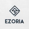
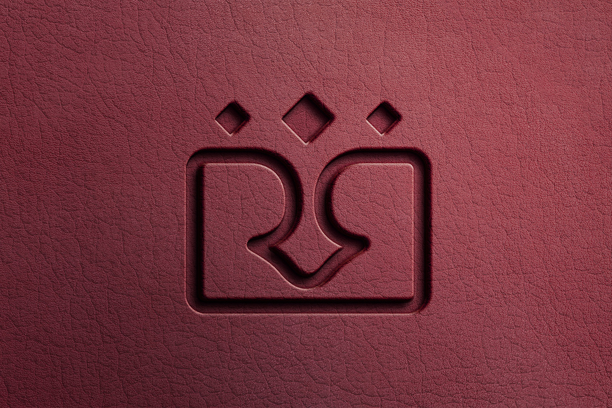
The logo mark consists of geometric lines that form a Rhombus and an abstract formation of the letter E.
The connected lines symbolize various shapes such as the home, compass, mountains, sun. Each corner points the direction as in the compass. Those elements were specifically chosen to communicate adventure, belonging, safety.
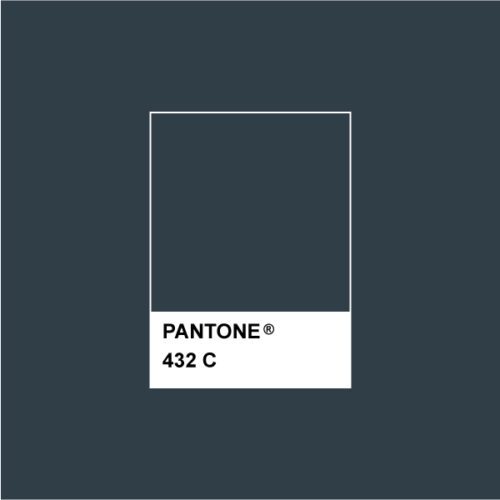
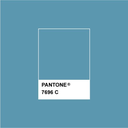
The brand colors were selected using color psychology and strategically to differentiate from competitors.
Primary Color: Dark
Secondary Color: Green
COLORS
”Valeria kindly advised & redirected me from wanting only just a “logo” for my website into creating branding that suited my freelance business needs. I was impressed how quickly she understood my needs and responded to my feedback.
Pericles PericleousCEO / Web & Software Engineer / REGNABYTES
Her service was delivered in a professional manner and reached my expectations. I really appreciated being presented with the right options. I had her guidance at every step of the branding process. The outcome is impressive. Very valuable creative services. Strongly recommended!
FINAL PROJECT
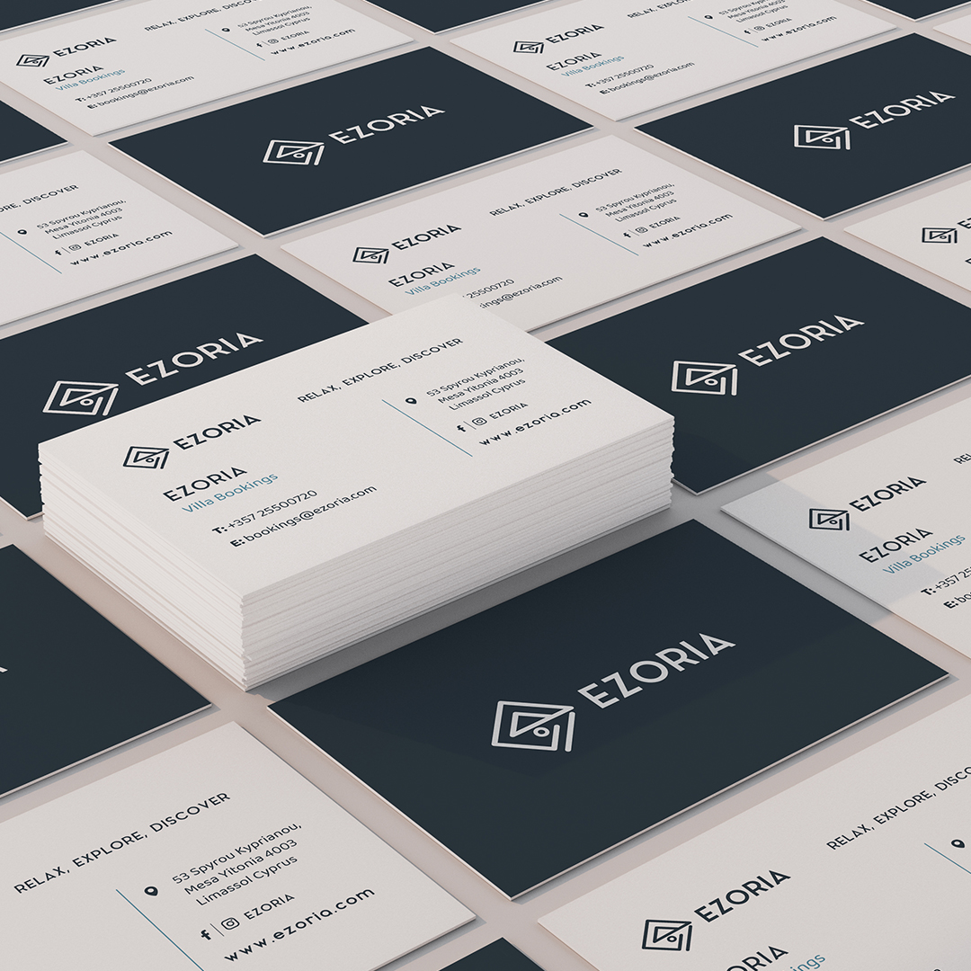
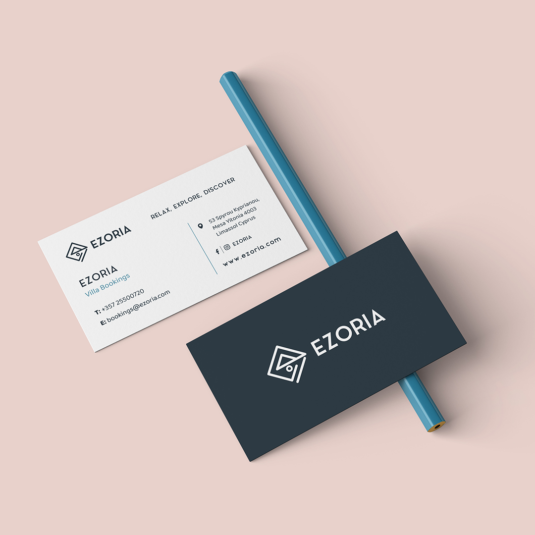
BUSINESS CARDS & STATIONERY
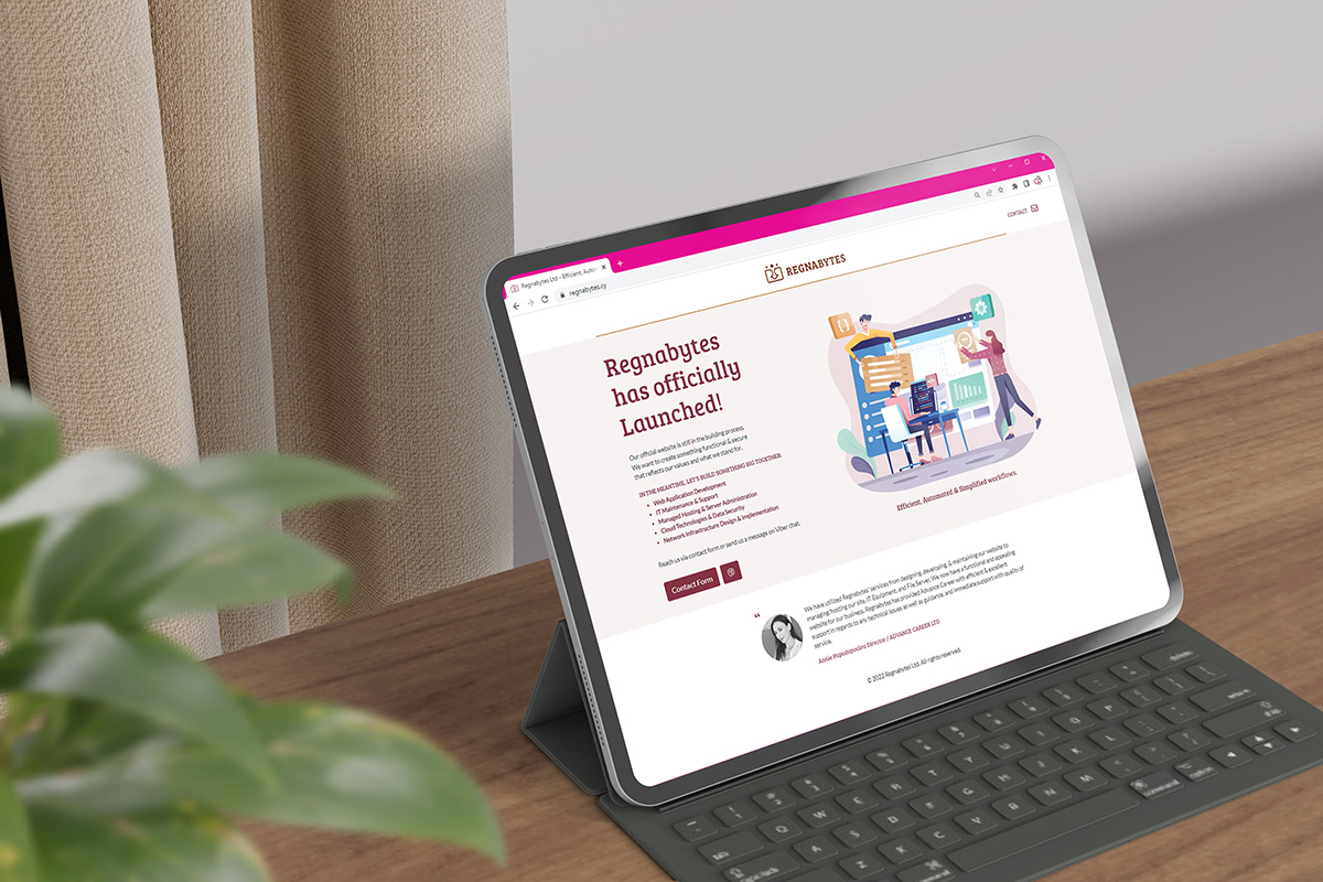
LANDING PAGE
