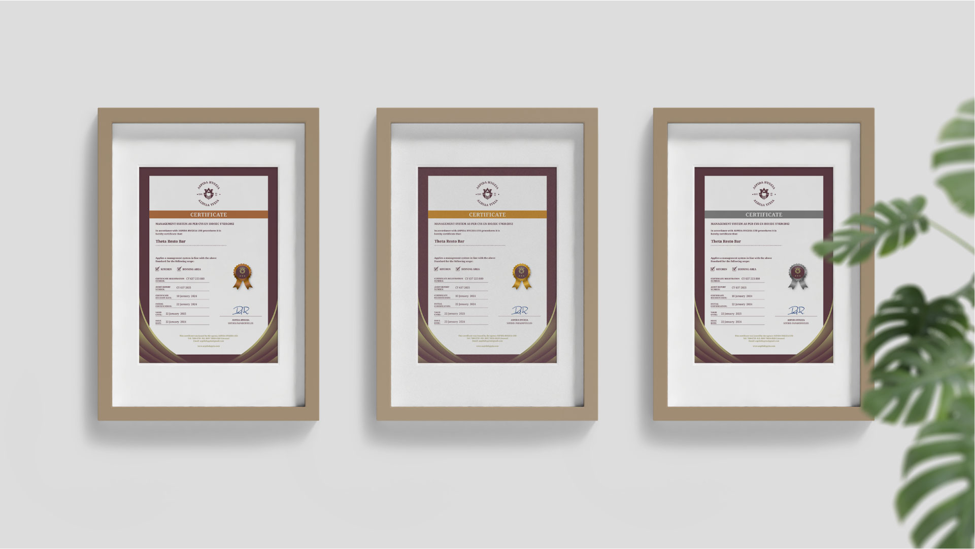
Aspida Hygeia specializes in cleanliness and hygiene certification for food sector premises, adhering to strict Nordic standards. The company conducts detailed inspections to identify and address microbial contamination risks on food surfaces, thus enhancing food safety and quality management.
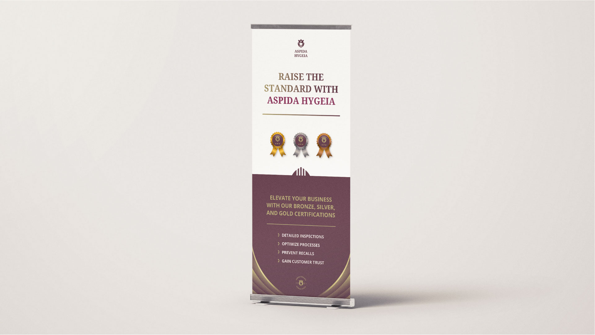
Aspida Hygeia offers three levels of certification, Bronze, Silver, and Gold, each representing a higher standard of compliance and excellence in hygiene practices. This tiered certification system allows businesses to demonstrate their commitment to health and safety at varying levels.
PROJECT GOAL:
Aspida Hygeia’s goal was to establish a professional & trusted presence as the go-to specialist for cleanliness and hygiene all around Cyprus & Europe.
BRAND NAME:
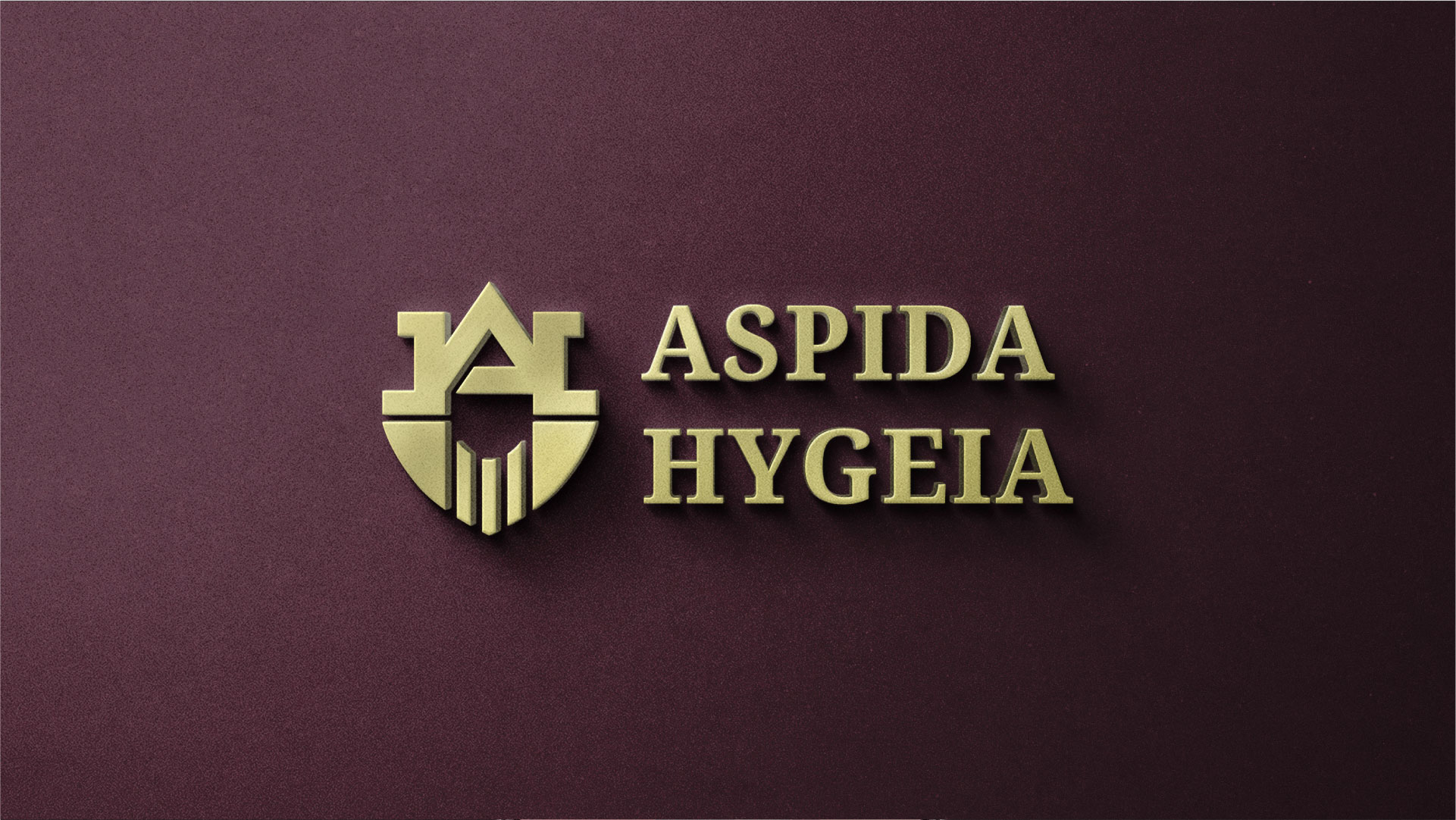
Aspida Hygeia (Greek name meaning Shield of Health)
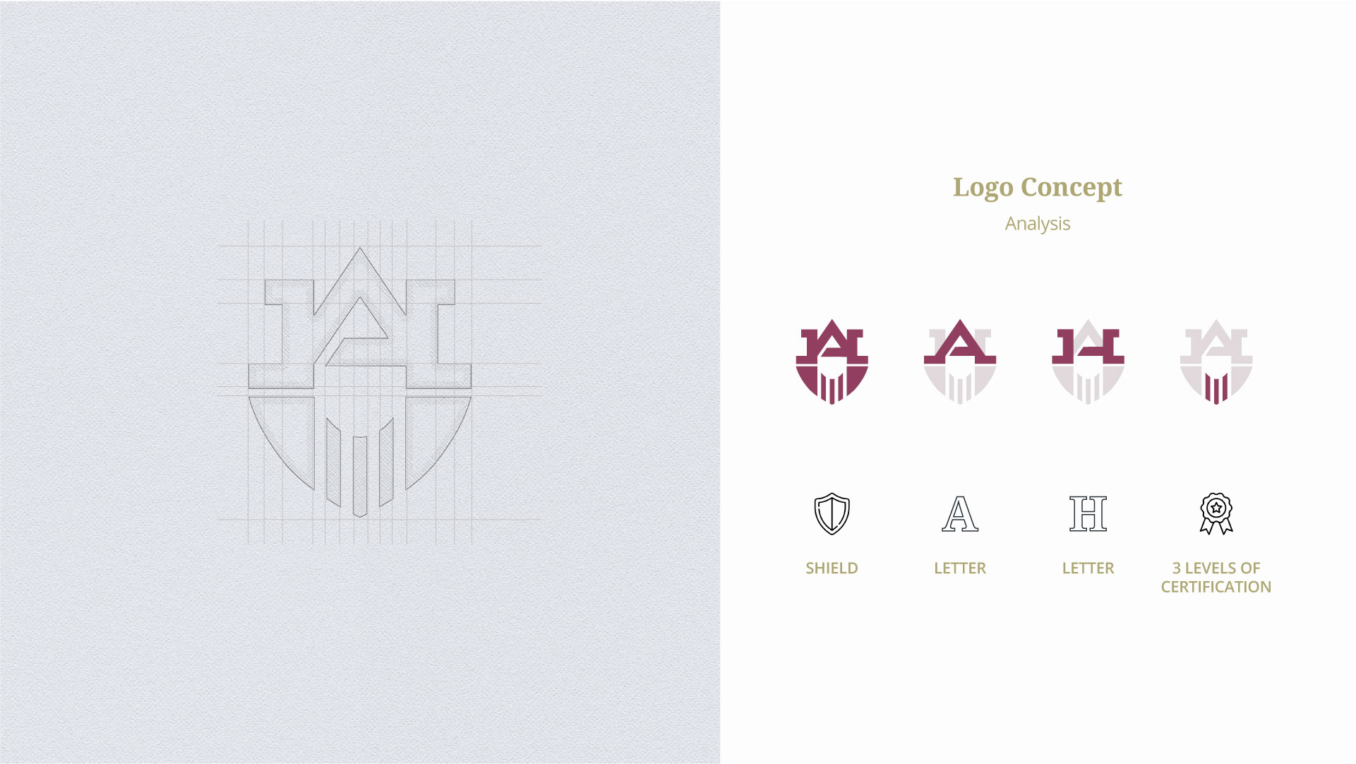
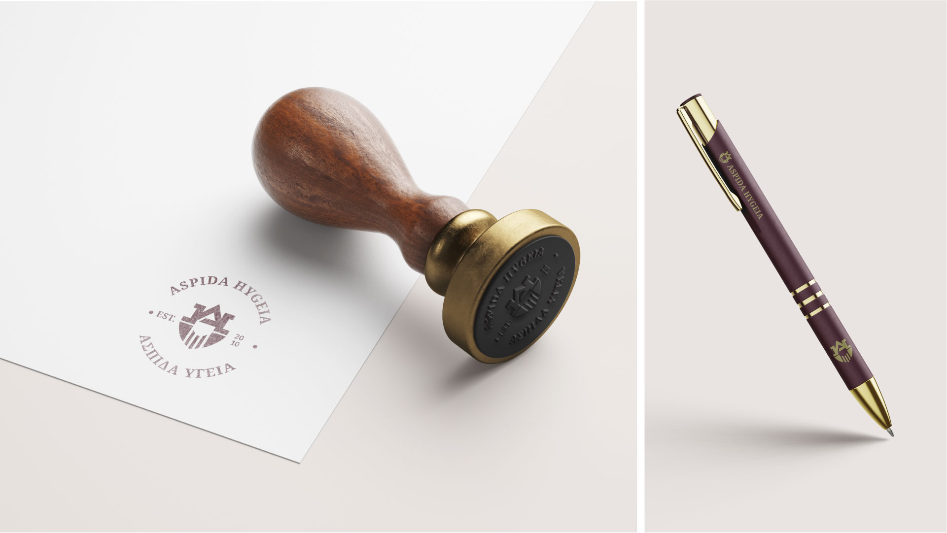
LOGO SYMBOL:
The logo symbol illustrates a shield which symbolizes strength to protect and defend.
The shield embodies their commitment to safeguarding cleanliness and hygiene standards. The three lines at the bottom represent the three levels of certification: Bronze, Silver, and Gold signifying varying degrees of excellence.
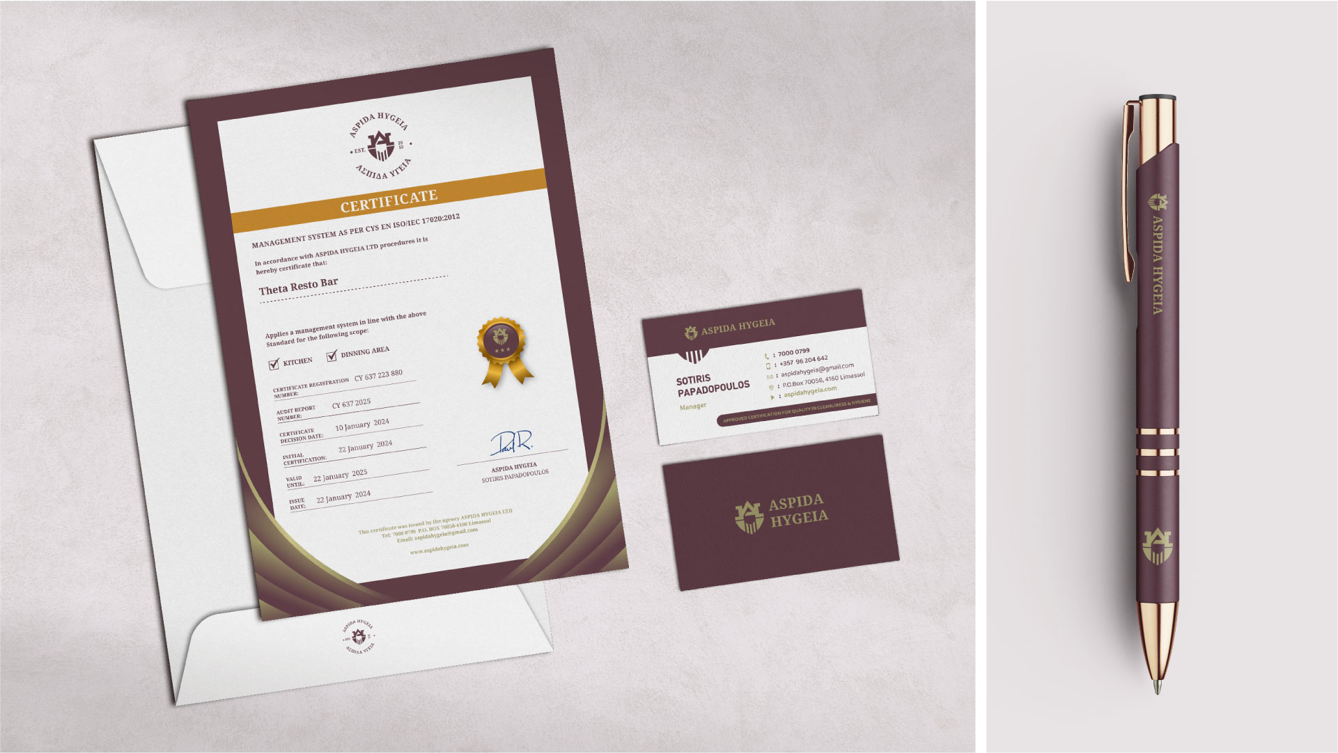
BRAND COLORS:
Colors were strategically chosen to differentiate from competitors as the majority of them use blue and green to convey trust, reliability, and hygiene.
Primary Color: Bordeaux (trust, power, credibility)
Secondary Color: Golden Green (Success, Achievement, Prestige)
FONTS:
Serif font: Authority and Reliability / Sophistication & Timelessness
Sans: Clarity and Legibility / Modern
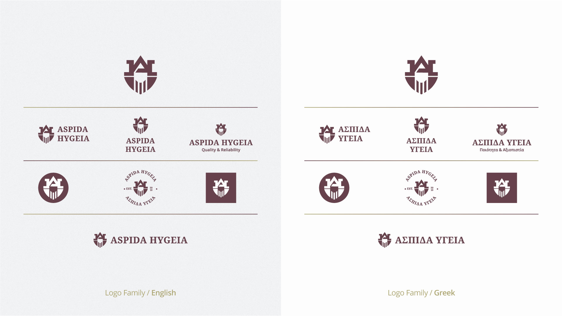
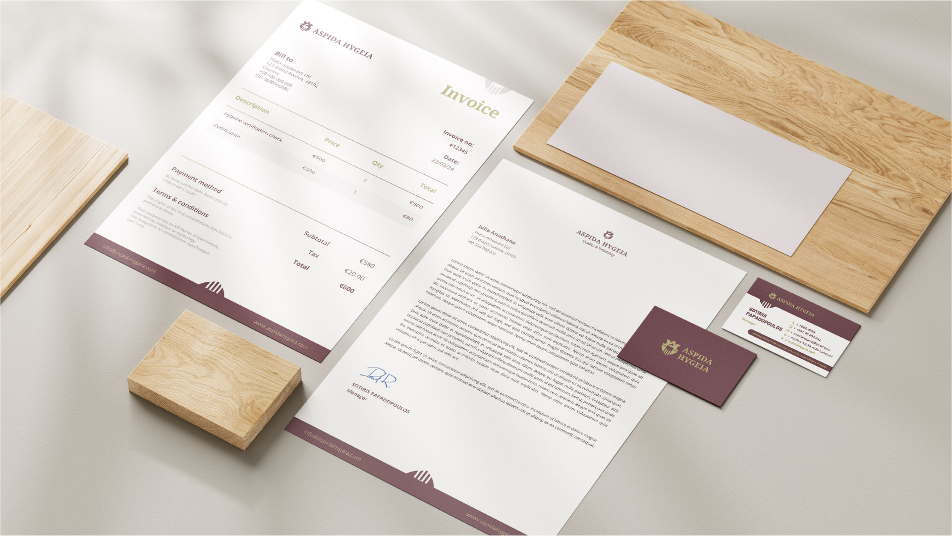
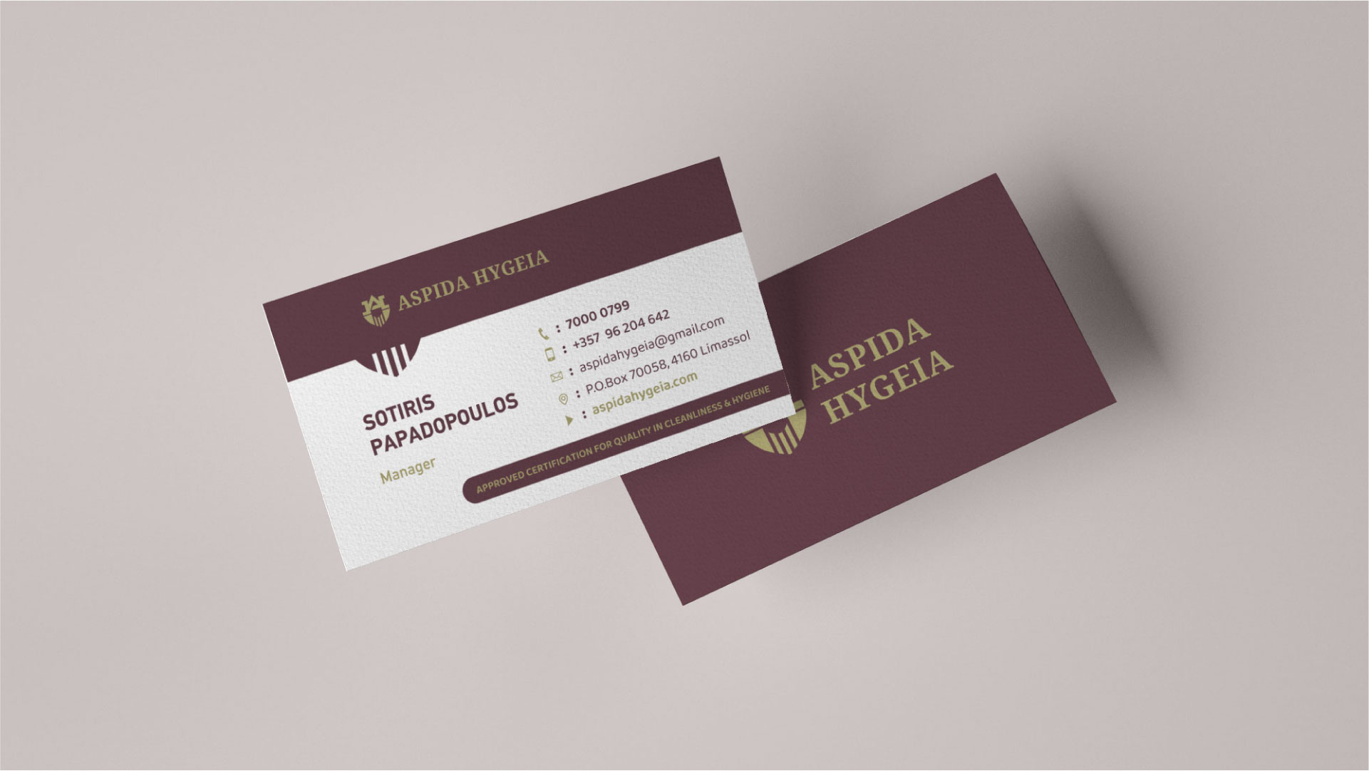
LOGO FAMILY:
A versatile logo family and complementary color palette were developed to ensure the visual identity adapts seamlessly across different platforms. Recognizing the linguistic needs of our audience, Greek and English versions of the logos were crafted. This dual-language approach ensures that the visual identity is approachable, resonant with all our customers, and maintains visual consistency.