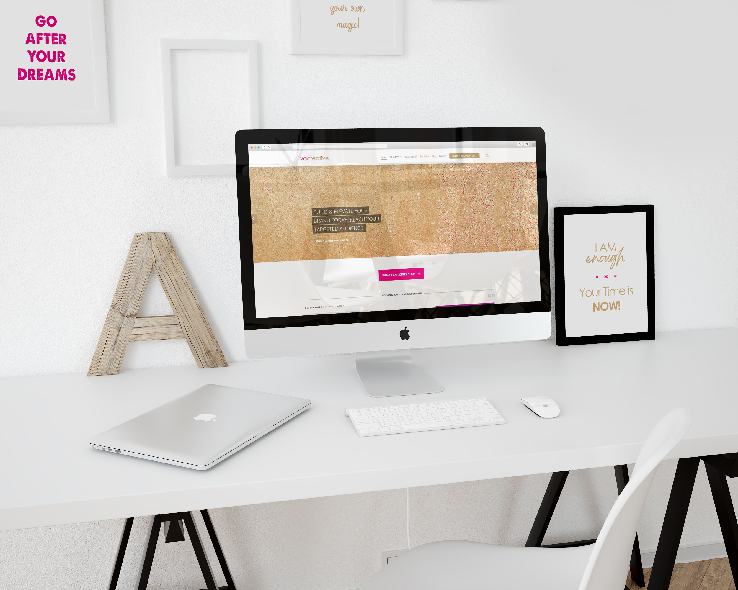
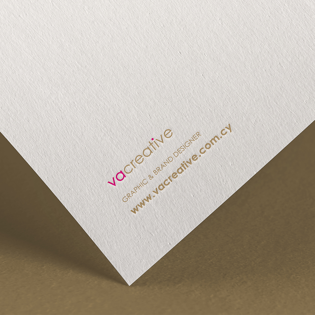
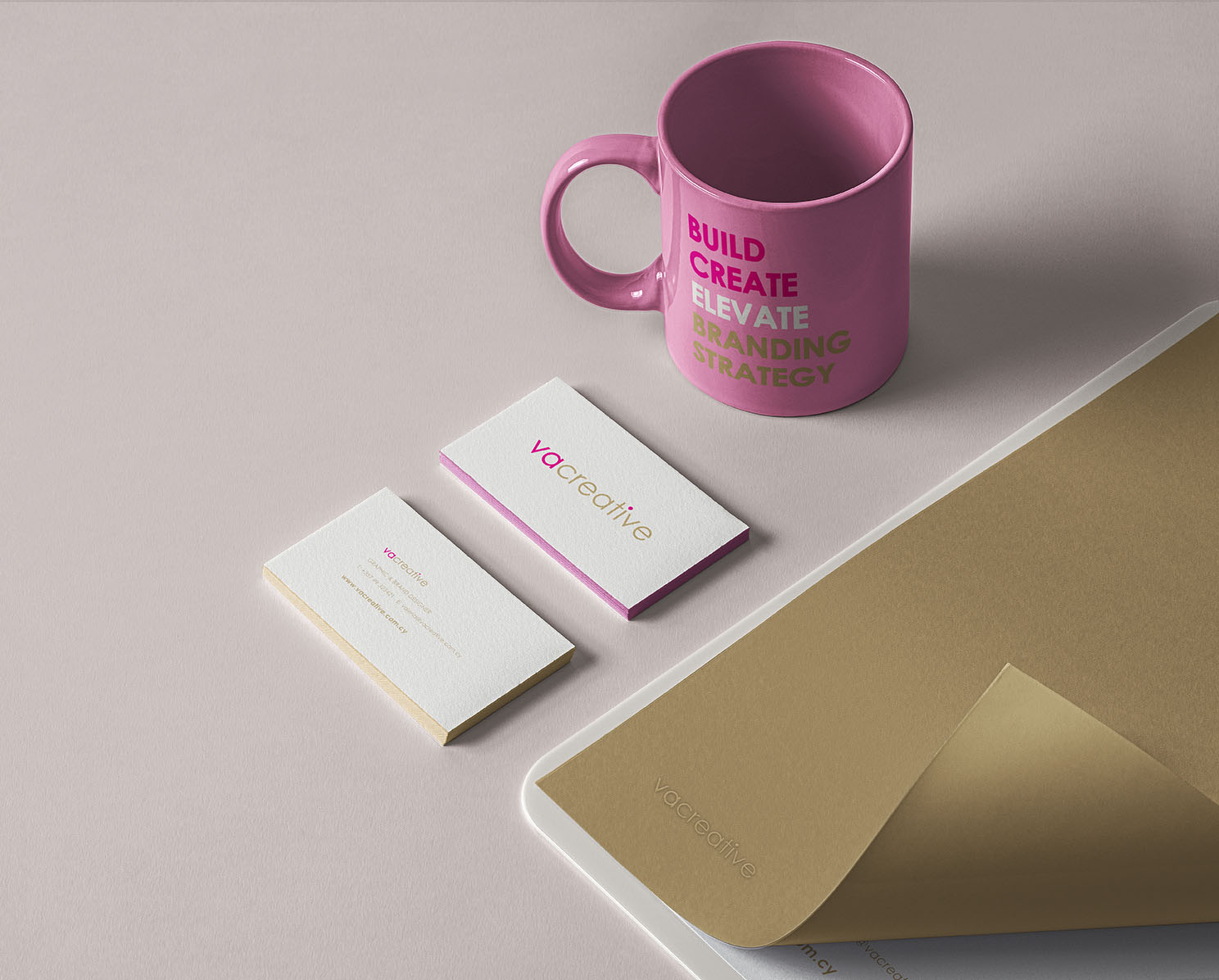
The vacreative branding and logo are kept simple and minimal. This is the best direction for my targeted audience. The logo doesn’t represent what I do, or show of my skills or is overly creative. It is there to identify.
VACREATIVE is a text-based logo. It is easy to read. It will not make people overthink what it is or confuse them.
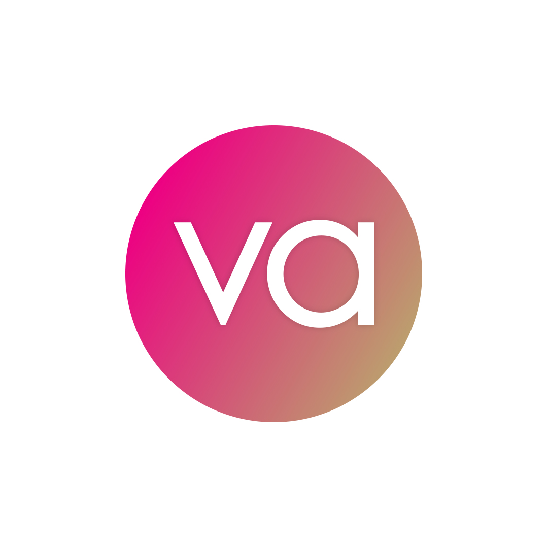
BOLD – FEMININE – WARMTH
These were the assets I wanted my logo to represent.
BOLD: Showing an ability to take risks, confidence & courage (typography) FEMININE: To represent a part of my identity (color combination) WARMTH: To create the sense of comfortless & approachable (color combination)